Only last night, several images were released of Newcastle and Puma’s black and white home strip for the 2014-15 season.
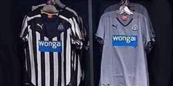
This season’s home kit is once again Newcastle’s traditional black and white striped shirt. However, it also features a hint of gold on the sleeves and puma logo. This year the black and white strips have been cut smaller, with 20 stripes in total on the shirt. Each stripe roughly 3cm’s long. The historic black and white pattern is featured all over the shirt accept on the upper chest where a stretched black diamond shape is embroidered from the top of the shoulders along to the neck. On either side of the black diamond are the golden Puma logo and the iconic Newcastle United crest. Both of these logos are stuck on either side of the upper chest.
Once again this year trading company Wonga.com are the clubs shirt sponsors. Just underneath the black diamond shape is the large blue speech bubble with wonga.com on it. On previous kits, many Newcastle fans have criticised the huge and unattractive blue logo comments like “It ruins a perfectly good kit” have been made. This season, I believe that the wonga.com logo is even bigger than in previous years and this may give Newcastle United fans another excuse to moan about something.
The socks and shorts are yet to be released, however, it’s expected to be in keeping with the traditional black and white, and possibly the new hint of gold.
I think this season the Newcastle strip is very smart and I would be happy if my club had a kit like it. I’ve already seen across twitter unhappy Newcastle fans about the shirt.
 RSS Feed